

2020's Hottest Paint Colors: Which Is Your Favorite?
January 13, 2020
Paint firms have chimed in with their choices for 2020 Color of the Year, and blues, greens, and pinks dominate the field. Here's an overview of the color picks of leading paint companies.
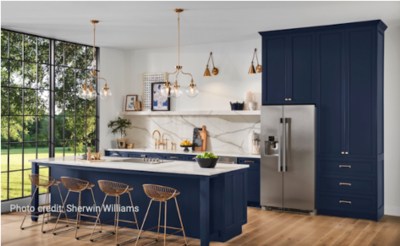
1. Sherwin Williams: Naval
Sherwin Williams chose a rich navy color called "Naval" in a nod to the Art Deco era. The paint firm says Naval is a timeless color that can easily pair with a mix of natural materials, such as brass tones, and a wide range of textures.
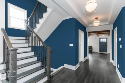
2. PPG: Chinese Porcelain
Paint firm PPG chose "Chinese Porcelain," a blend of cobalt and muted navy tones, as its 2020 Color of the Year. "Consumers are tiring of stark grays and are looking to infuse colors that delight the senses," says Dee Schlotter, senior color manager at PPG. "Blue is the easiest possible entry point from the world of neutrals to the world of color."
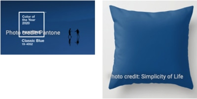
3. Pantone: Classic Blue
Pantone made a simple choice with "Classic Blue" as its 2020 Color of the Year. The paint company describes the color—which is remarkably close to REALTOR® Blue—as the "sky at dusk," "timeless," "easily relatable," and "restful." The color is being shown prominently on walls, rugs, decorative pillow accents, and kitchen cabinets.
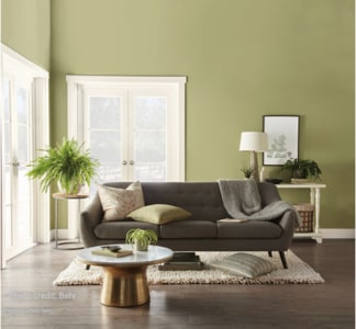
4. Behr: Back to Nature
Behr's top color pick for 2020 is a meadow-inspired green called "Back to Nature." The yellow-based, greenish hue aims to give the illusion of bringing the outdoors inside, whether splashed on a living room wall or bedroom throw pillow.
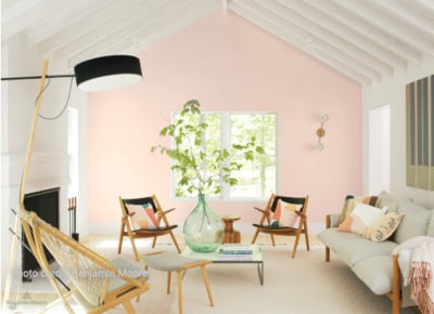
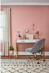
5. Benjamin Moore: First Light
Benjamin Moore chose "First Light," a soft, rosy color that follows the rising popularity of pinks and blushes. "First Light reflects a new definition of the home—a shift in mindset from the material to satisfying the core needs in life: community, comfort, security, self-expression, authenticity," says Andrea Magno, Benjamin Moore's director of color marketing and development.
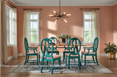
6. HGTV Home by Sherwin Williams: Romance
HGTV Home also jumped on the pink trend with "Romance," a soft, dusty shade. It has been shown as an accent against blues or as a dominant color on walls or furniture. The pale pink is a versatile color reminiscent of rose gold and rose copper, the company says.
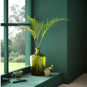
7. Graham & Brown: Adeline
The British wallpaper company Graham & Brown offered a deep green hue called "Adeline" as its pick for 2020 Color of the Year. It's a hunter green shade and yet another nod to the natural world.
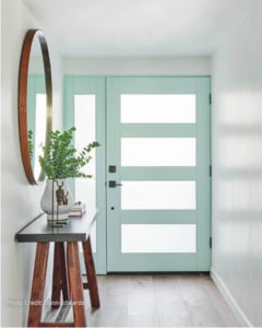
8. Dunn-Edwards: Minty Fresh
Pastels are trending, and that's why Dunn-Edwards chose "Minty Fresh," a soft green that is meant to have a nostalgic 1950s feel. The company says the relaxing pastel evokes "calm" and "clean."
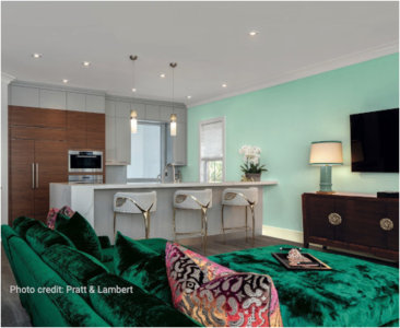
9. Pratt & Lambert: Songbird
Pratt & Lambert also went with a mint shade called "Songbird," a color it refers to as "youthful" and "optimistic." They predict a growth in botanical hues and chalky pastels in 2020. "Luxury and design are being looked at in a new light, with the influence of Hygge and pairing back movement. Our 2020 trending colors are a perfect example of this balance—a blend of glamorous jewel hues grounded by neutral tones," says Ashley Banbury, senior color designer for Pratt & Lambert Paints.
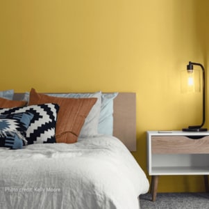
10. Kelly Moore: Sun God
The paint brand Kelly Moore went bright and sunny with its choice of "Sun God." Kelly Moore describes the color as "a brash, brassy yellow" that sets out to disrupt "white rooms and monochromatic schemes" with a powerful color punch. The firm predicts bright yellow to show up on everything from faucets and cabinets to upholstery and accent walls. "It's a fresh accent color that pairs with neutrals just as well as pink has over the past few years, but the look is more bold and grown-up," the company says.
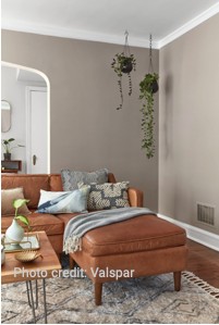
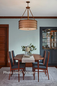
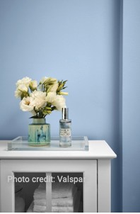
11. Valspar: 12 Nature-Inspired Colors
Instead of choosing just one color this year, Valspar chose 12 that it expects to be popular in 2020. The hues range from pale earthy neutrals (Winter Calm, Canyon Earth, Desert Fortress, Pale Powder) to cooler tones (Secret Moss, Secluded Garden, Tempered Sage, Grey Brook, Mint Whisper, Utterly Blue) and pinks (Bombay Pink, Crushed Out). "The palette of colors accepted as neutrals in the home has expanded," says Sue Kim, Valspar's color marketing manager. Valspar said that the landscape and outdoors served as a major inspiration behind its 2020 color palette.
Source: "2020's Hottest Paint Colors: Which Is Your Favorite?" National Association of REALTORS® (January 13, 2020) Melissa Dittmann Tracey