

Behr Paint Color of the Year
August 27, 2018
When a paint company chooses a Color of the Year, it has a rainbow to choose from.
But the question is relatively black or white: Select a polarizing, controversial hue (a la Greenery, Pantone's stomach-churning Color of the Year for 2016), or pick a crowd-pleasing shade sure to wind up on walls across the country.
The Color of the Year often foreshadows decor trends, but people are likely to apply a coat of it in their own home only if a color is approachable. Perhaps that's why Behr Paint went with one of the most agreeable shades we've seen in a while.
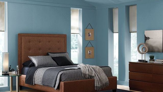
For its 2019 Color of the Year, the paint company presents Blueprint S470-5, which is a "strong and grounded, midrange blue that commands attention, but isn’t overwhelming," says Erika Woelfel, vice president of color and creative services at Behr.
It's a cool blend of blue, gray, and green, which can suit a number of design styles and aesthetic sensibilities. A traditional craftsman home could rock Blueprint just as easily as a modern farmhouse. It's a classic, simple, likable color.
If we compared the color with an everyday object, we'd say it's akin to your favorite pair of jeans.
"Blue has a calming effect, so Blueprint is a perfect choice if you’re looking for a color that creates a feeling of comfort and positivity," says Woelfel.
After Behr's announcement, Blueprint was welcomed by design experts with open arms.
"I love its versatility," says Lesley Myrick, owner and principal of Lesley Myrick Art + Design in Waco, TX. "It's not as visually demanding as navy blue, but packs much more of a punch than pastel blues do. It has a chalky, gray undertone that keeps it feeling soft and approachable."
Interior designer Ana Cummings says the shade Behr picked is of the moment: "It's really on point with the market right now. I mean, how many blue kitchen islands are we seeing these days? Lots!" In fact, she's doing a client's entire TV room in a similar shade right now.
Playing it safe
While Blueprint met with emphatically positive reviews, many of the designers we spoke with agreed it's not a very daring shade.
"Daring to me is painting your walls burnt orange or a deep red," says Kiley Story, owner and creative director of home decor brand Homies. Blueprint "is a color that you won't tire of easily."
Cummings says this shade of blue isn't a huge departure for folks willing to try something new.
"It’s maybe one or two steps up the boldness ladder, not 10," she says.
Woelfel agrees, saying, "You don’t have to be a risk taker to incorporate this color into your home."
If you're risk-averse when it comes to decor, but itch for a splash of color in your home, Blueprint could strike just the right tone.
Best ways to use Blueprint in the home
A color this versatile will likely complement a variety of spaces, but the experts we spoke with see it working best on a front door, on an accent wall in a family room, or in a powder room.
"I particularly love it in a bedroom setting because it's such a calming color for when you are trying to wind down from the day," Story says.
If you're hesitant to commit to four walls of blue, she suggests starting with the wall your headboard is touching.
"Painting just one accent wall is less of a commitment and can change the entire feeling of a room," she says. "For folks who would like even less of a commitment, pillows and rugs are a great option."
As a testament to the timelessness of this shade of blue, look no further than this recently renovated apartment for sale in New York City's oldest co-op.
The $3 million pad is creating a stir with its over-the-top interiors, but we spotted blue hues that look strikingly similar to Blueprint throughout the home. It seems this is one color that will stand the test of time.
Source: "Choosing a Soothing Shade, Behr Draws Up Blueprint as Its Color of the Year" REALTOR.com (August 28, 2018) Natalie Way